> ## Documentation Index
> Fetch the complete documentation index at: https://cometchat-22654f5b-docs-agent-native-development.mintlify.site/llms.txt
> Use this file to discover all available pages before exploring further.
# Pinned Messages
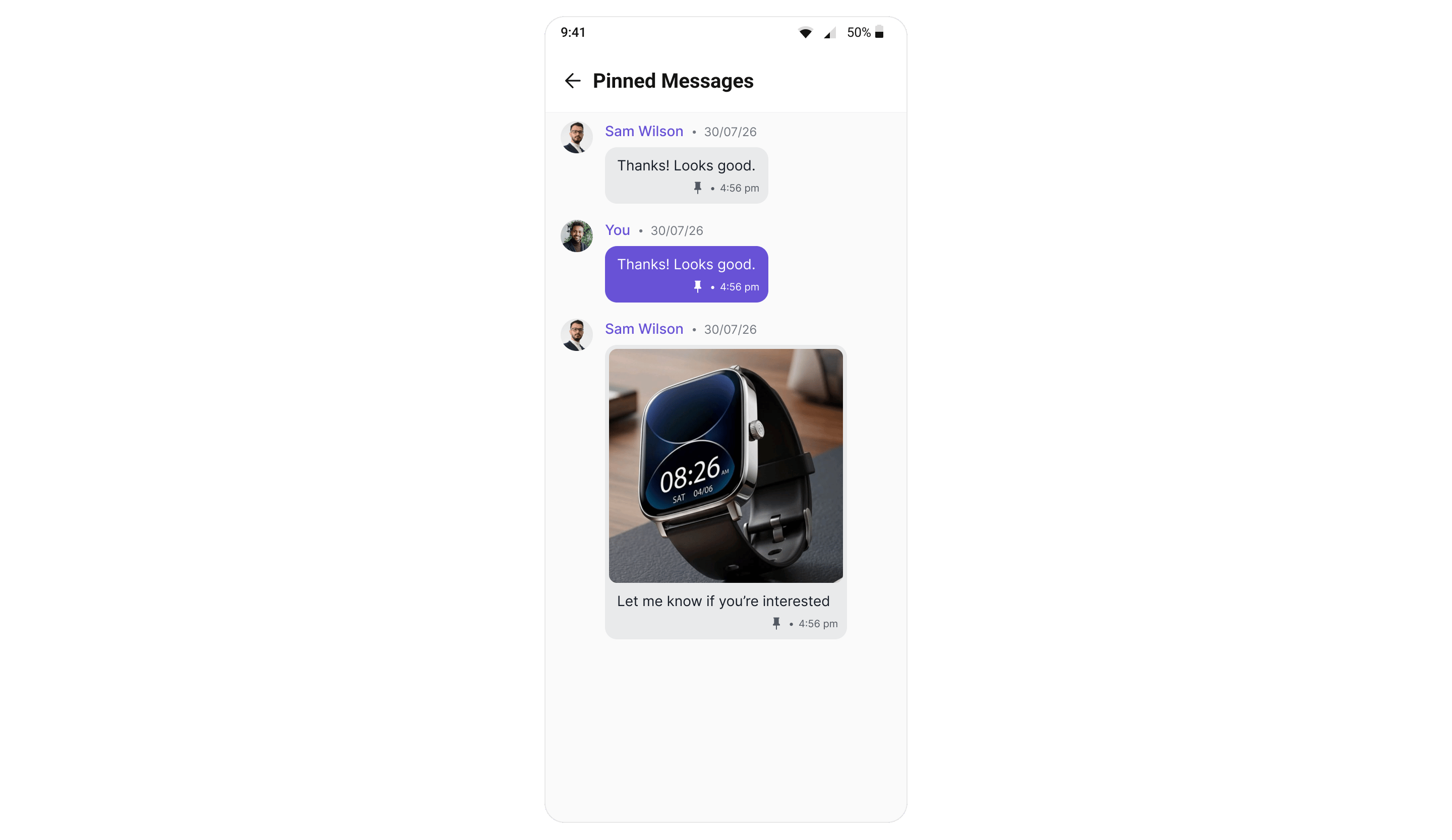
> Display the messages pinned in a conversation, with unpin, save, copy, share and info actions.
```json theme={null}
{
"component": "CometChatPinnedMessages",
"package": "@cometchat/chat-uikit-react-native",
"import": "import { CometChatPinnedMessages } from \"@cometchat/chat-uikit-react-native\";",
"description": "Lists the messages pinned in a conversation, newest pin first. A pin is conversation-wide and visible to everyone.",
"requires": {
"dashboardFlag": "Pin Messages must be enabled for your app in the CometChat Dashboard",
"resolution": "The kit reads the flag at login and re-reads it on every reconnection — no app code required"
},
"props": {
"data": {
"user": { "type": "CometChat.User", "default": "undefined", "note": "Scopes the panel to a one-on-one conversation. Mutually exclusive with group" },
"group": { "type": "CometChat.Group", "default": "undefined", "note": "Scopes the panel to a group. Mutually exclusive with user" },
"limit": { "type": "number", "default": 30, "note": "Page size for the fetch; the SDK caps it at 100" },
"messagesRequestBuilder": { "type": "CometChat.MessagesRequestBuilder", "default": "undefined", "note": "Base request for the fetch. The component copies it and re-asserts setPinnedOnly(true), setSavedOnly(false) and the user/group scope; the limit prop wins over the builder's own setLimit()" },
"textFormatters": { "type": "CometChatTextFormatter[]", "default": "undefined", "note": "Pass the same array given to CometChatMessageList so a row reads the same as it does in the conversation" }
},
"callbacks": {
"onBack": "() => void",
"onItemPress": "(message: CometChat.BaseMessage) => void"
},
"visibility": {
"hideUnpinMessageOption": { "type": "boolean", "default": false },
"hideSaveMessageOption": { "type": "boolean", "default": false },
"hideUnsaveMessageOption": { "type": "boolean", "default": false },
"hideCopyMessageOption": { "type": "boolean", "default": false },
"hideShareMessageOption": { "type": "boolean", "default": false },
"hideMessageInfoOption": { "type": "boolean", "default": false }
},
"customization": {
"ItemView": "(message: CometChat.BaseMessage) => JSX.Element",
"title": { "type": "string", "default": "localized" },
"style": "DeepPartial"
}
}
}
```
`CometChatPinnedMessages` lists the messages pinned in one conversation, newest pin first. A pin is
conversation-wide and visible to everyone, so this panel shows the same set to every participant.
**Pin Messages must be enabled for your app in the CometChat Dashboard.** Until it is, the pin
options never render and this panel has nothing to show. The UI Kit reads that flag itself at
login and on every reconnect — there is no app code to write.
**`messagesRequestBuilder` and `textFormatters` require `@cometchat/chat-uikit-react-native` 5.5.1 or later.** Neither prop exists in 5.5.0. Everything else on this page works on either version.
## Where It Fits
Open it from the message header or an overflow menu, scoped to the conversation the user is in. It is
a full-screen panel with its own back affordance rather than an inline strip.
 ## Minimal Render
Pass **exactly one** of `user` or `group` — the panel is scoped to a single conversation.
```tsx theme={null}
import { CometChatPinnedMessages } from "@cometchat/chat-uikit-react-native";
navigation.goBack()}
onItemPress={(message: CometChat.BaseMessage) => scrollToMessage(message)}
/>
```
```tsx theme={null}
import { CometChatPinnedMessages } from "@cometchat/chat-uikit-react-native";
navigation.goBack()}
onItemPress={(message: CometChat.BaseMessage) => scrollToMessage(message)}
/>
```
## Filtering
Pass a `messagesRequestBuilder` to control which pinned messages are fetched — a search term, a
category or type filter, or the page size. Set `setPinnedOnly(true)` on the builder to make the
intent explicit; the component re-asserts it on its own copy, so leaving it out is safe.
```tsx theme={null}
import { CometChat } from "@cometchat/chat-sdk-react-native";
import { CometChatPinnedMessages } from "@cometchat/chat-uikit-react-native";
```
The component works on a **copy** of your builder and re-asserts `setPinnedOnly(true)`,
`setSavedOnly(false)` and the `user` / `group` conversation scope on it, so those are safe even if
you omit them — but keep `setPinnedOnly(true)` in your code to make the intent explicit. Your own
instance is never mutated, so the same builder can also go to
[`CometChatSavedMessages`](/ui-kit/react-native/saved-messages).
The page size comes from the first of these that is set: the `limit` prop, then the builder's own
`setLimit()`, then `30`.
## Actions and Events
### Callback Props
#### onItemPress
Fires when a pinned row is tapped. The panel does not navigate for you — use it to close the panel and jump your message list to that message.
```tsx lines theme={null}
import { CometChatPinnedMessages } from "@cometchat/chat-uikit-react-native";
import { CometChat } from "@cometchat/chat-sdk-react-native";
function PinnedWithJump({ group }: { group: CometChat.Group }) {
const handleItemPress = (message: CometChat.BaseMessage) => {
navigation.goBack();
scrollToMessageId(message.getId());
};
return ;
}
```
#### onBack
Fires when the back affordance in the header is pressed.
```tsx lines theme={null}
navigation.goBack()} />
```
### Events
The panel keeps itself current from the kit's event bus, so a pin made anywhere — this screen, the message list, or another participant's device — lands here without a manual refresh.
| Event | Fires when |
| - | - |
| `ccMessagePinned` / `ccMessageUnpinned` | This device pinned or unpinned. |
| `ccMessageSaved` / `ccMessageUnsaved` | This device saved or unsaved. |
| `onMessagePinned` / `onMessageUnpinned` | Another participant pinned or unpinned — broadcast to everyone. |
| `onMessageSaved` / `onMessageUnsaved` | The same user saved on another device — private multi-device. |
**Removing asks, adding does not.** Unpin and Unsave show a confirmation; Pin and Save run
immediately. This is deliberate and consistent across all CometChat UI Kits — the additive action
has its own undo one tap away, the destructive one does not.
***
## Opening from the Message Header
`CometChatMessageHeader` can raise the entry point for you. Set `showPinnedMessagesButton` and handle `onPinnedMessagesPress`.
Despite the name, this is **not a standalone button**. It adds a localized **"Pinned Messages" item
to the header's `⋮` overflow menu**, alongside anything your own `options` prop contributes. On a
header with no other menu items, turning it on is what makes the `⋮` appear at all.
```tsx lines theme={null}
import {
CometChatMessageHeader,
CometChatMessageList,
} from "@cometchat/chat-uikit-react-native";
function Messages({ user, group }) {
return (
<>
navigation.navigate("PinnedMessages", { user, group })
}
/>
);
}
```
**Both props are required.** `showPinnedMessagesButton={true}` on its own does nothing — the menu
item is only added when `onPinnedMessagesPress` is also supplied, and there is no warning when it
is missing.
***
## Custom View Slots
| Slot | Signature | Replaces |
| - | - | - |
| `ItemView` | `(message: CometChat.BaseMessage) => JSX.Element` | Entire pinned row — sender line and bubble |
The empty, error and loading states are not view slots on this component. Restyle them through `style.emptyStateStyle` and `style.errorStateStyle` instead — see [Styling](#styling).
### ItemView
Replace the whole row, including the sender line above the bubble.
```tsx lines theme={null}
import { CometChatPinnedMessages, useTheme } from "@cometchat/chat-uikit-react-native";
import { CometChat } from "@cometchat/chat-sdk-react-native";
import { View, Text } from "react-native";
function CustomPinnedRow({ group }: { group: CometChat.Group }) {
const theme = useTheme();
const getItemView = (message: CometChat.BaseMessage) => (
{message.getSender()?.getName()}
{(message as CometChat.TextMessage).getText?.()}
);
return ;
}
```
***
## Common Patterns
### Read-only panel
Hide every mutating action and leave the panel as a reference list.
```tsx lines theme={null}
```
### A custom title and close icon
```tsx lines theme={null}
```
***
## Styling
The component uses the theme system from `CometChatThemeProvider`. Pass a `style` prop to customize the appearance. Every default value resolves from a semantic theme token, so retheming the kit restyles this panel without touching it.
```tsx lines theme={null}
import { CometChatPinnedMessages } from "@cometchat/chat-uikit-react-native";
function StyledPinnedMessages({ group }) {
return (
);
}
```
### Style Properties
| Property | Type | Description |
| - | - | - |
| `containerStyle` | `ViewStyle` | Root container |
| `headerContainerStyle` | `ViewStyle` | Header row holding the back control and title |
| `titleStyle` | `TextStyle` | Header title text |
| `closeButtonIconStyle` | `ImageStyle` | Size and tint of the back control |
| `closeButtonIcon` | `ImageSourcePropType \| JSX.Element` | Replaces the back icon itself |
| `itemStyle` | `object` | One pinned row — see below |
| `emptyStateStyle` | `object` | `containerStyle`, `titleStyle`, `subTitleStyle`, `iconStyle` |
| `errorStateStyle` | `object` | `containerStyle`, `titleStyle`, `subTitleStyle`, `iconStyle` |
`itemStyle` keys:
| Property | Type | Description |
| - | - | - |
| `containerStyle` | `ViewStyle` | The row |
| `headerContainerStyle` | `ViewStyle` | Avatar + sender name + date line above the bubble |
| `avatarStyle` | `object` | Sender avatar |
| `senderNameStyle` | `TextStyle` | Sender name |
| `separatorStyle` | `TextStyle` | Divider between sender name and date |
| `dateStyle` | `object` | Pin timestamp |
| `savedIndicatorStyle` | `ImageStyle` | Bookmark shown when a pinned message is **also** saved by this viewer |
| `savedIndicatorContainerStyle` | `ViewStyle` | Wrapper around that bookmark |
| `bubbleContainerStyle` | `ViewStyle` | Left inset that lines the bubble up under the sender name |
***
## Props
Provide either `user` or `group`, not both. All other props are optional.
### user
Scopes the panel to a one-on-one conversation.
| | |
| - | - |
| Type | `CometChat.User` |
| Default | — |
Mutually exclusive with `group`.
***
### group
Scopes the panel to a group conversation.
| | |
| - | - |
| Type | `CometChat.Group` |
| Default | — |
Mutually exclusive with `user`.
***
### limit
Page size for the fetch.
| | |
| - | - |
| Type | `number` |
| Default | `30` |
The server rejects a value above 100.
***
### messagesRequestBuilder
Base request used to fetch the pinned messages — a search term, a category or type filter, or the
page size. See [Filtering](#filtering).
| | |
| - | - |
| Type | `CometChat.MessagesRequestBuilder` |
| Default | — |
The component copies the builder and re-asserts `setPinnedOnly(true)` on the copy, so your instance is never
mutated. The `limit` prop wins over the builder's own `setLimit()`.
***
### textFormatters
Text formatters used when rendering the pinned rows. Pass the same array you give
[`CometChatMessageList`](/ui-kit/react-native/message-list), otherwise a message reads differently
here than it does in the conversation. See
[Text Formatters](/ui-kit/react-native/custom-text-formatter-guide).
| | |
| - | - |
| Type | `CometChatTextFormatter[]` |
| Default | Default formatters from the data source |
***
### onBack
Called when the back affordance is pressed.
| | |
| - | - |
| Type | `() => void` |
| Default | — |
***
### onItemPress
Called when a row is pressed.
| | |
| - | - |
| Type | `(message: CometChat.BaseMessage) => void` |
| Default | — |
***
### hideUnpinMessageOption
Hides **Unpin** in the row's long-press menu.
| | |
| - | - |
| Type | `boolean` |
| Default | `false` |
***
### hideSaveMessageOption
Hides **Save** in the row's long-press menu.
| | |
| - | - |
| Type | `boolean` |
| Default | `false` |
***
### hideUnsaveMessageOption
Hides **Unsave** in the row's long-press menu.
| | |
| - | - |
| Type | `boolean` |
| Default | `false` |
***
### hideCopyMessageOption
Hides **Copy**.
| | |
| - | - |
| Type | `boolean` |
| Default | `false` |
***
### hideShareMessageOption
Hides **Share**.
| | |
| - | - |
| Type | `boolean` |
| Default | `false` |
***
### hideMessageInfoOption
Hides **Message Info**.
| | |
| - | - |
| Type | `boolean` |
| Default | `false` |
***
### ItemView
Replaces the default row entirely.
| | |
| - | - |
| Type | `(message: CometChat.BaseMessage) => JSX.Element` |
| Default | — |
***
### title
Panel title.
| | |
| - | - |
| Type | `string` |
| Default | Localized "Pinned Messages" |
***
### style
Per-instance style overrides, merged over the theme's `pinnedMessagesStyles`.
| | |
| - | - |
| Type | `DeepPartial` |
| Default | — |
See [Styling](#styling).
***
## Next Steps
The private, cross-conversation counterpart
Where the Pin and Save options are raised
The SDK methods underneath this component
Every UI Kit event, in one place
This documentation is built and hosted on [Mintlify](https://mintlify.com), a developer documentation platform.
## Minimal Render
Pass **exactly one** of `user` or `group` — the panel is scoped to a single conversation.
```tsx theme={null}
import { CometChatPinnedMessages } from "@cometchat/chat-uikit-react-native";
navigation.goBack()}
onItemPress={(message: CometChat.BaseMessage) => scrollToMessage(message)}
/>
```
```tsx theme={null}
import { CometChatPinnedMessages } from "@cometchat/chat-uikit-react-native";
navigation.goBack()}
onItemPress={(message: CometChat.BaseMessage) => scrollToMessage(message)}
/>
```
## Filtering
Pass a `messagesRequestBuilder` to control which pinned messages are fetched — a search term, a
category or type filter, or the page size. Set `setPinnedOnly(true)` on the builder to make the
intent explicit; the component re-asserts it on its own copy, so leaving it out is safe.
```tsx theme={null}
import { CometChat } from "@cometchat/chat-sdk-react-native";
import { CometChatPinnedMessages } from "@cometchat/chat-uikit-react-native";
```
The component works on a **copy** of your builder and re-asserts `setPinnedOnly(true)`,
`setSavedOnly(false)` and the `user` / `group` conversation scope on it, so those are safe even if
you omit them — but keep `setPinnedOnly(true)` in your code to make the intent explicit. Your own
instance is never mutated, so the same builder can also go to
[`CometChatSavedMessages`](/ui-kit/react-native/saved-messages).
The page size comes from the first of these that is set: the `limit` prop, then the builder's own
`setLimit()`, then `30`.
## Actions and Events
### Callback Props
#### onItemPress
Fires when a pinned row is tapped. The panel does not navigate for you — use it to close the panel and jump your message list to that message.
```tsx lines theme={null}
import { CometChatPinnedMessages } from "@cometchat/chat-uikit-react-native";
import { CometChat } from "@cometchat/chat-sdk-react-native";
function PinnedWithJump({ group }: { group: CometChat.Group }) {
const handleItemPress = (message: CometChat.BaseMessage) => {
navigation.goBack();
scrollToMessageId(message.getId());
};
return ;
}
```
#### onBack
Fires when the back affordance in the header is pressed.
```tsx lines theme={null}
navigation.goBack()} />
```
### Events
The panel keeps itself current from the kit's event bus, so a pin made anywhere — this screen, the message list, or another participant's device — lands here without a manual refresh.
| Event | Fires when |
| - | - |
| `ccMessagePinned` / `ccMessageUnpinned` | This device pinned or unpinned. |
| `ccMessageSaved` / `ccMessageUnsaved` | This device saved or unsaved. |
| `onMessagePinned` / `onMessageUnpinned` | Another participant pinned or unpinned — broadcast to everyone. |
| `onMessageSaved` / `onMessageUnsaved` | The same user saved on another device — private multi-device. |
**Removing asks, adding does not.** Unpin and Unsave show a confirmation; Pin and Save run
immediately. This is deliberate and consistent across all CometChat UI Kits — the additive action
has its own undo one tap away, the destructive one does not.
***
## Opening from the Message Header
`CometChatMessageHeader` can raise the entry point for you. Set `showPinnedMessagesButton` and handle `onPinnedMessagesPress`.
Despite the name, this is **not a standalone button**. It adds a localized **"Pinned Messages" item
to the header's `⋮` overflow menu**, alongside anything your own `options` prop contributes. On a
header with no other menu items, turning it on is what makes the `⋮` appear at all.
```tsx lines theme={null}
import {
CometChatMessageHeader,
CometChatMessageList,
} from "@cometchat/chat-uikit-react-native";
function Messages({ user, group }) {
return (
<>
navigation.navigate("PinnedMessages", { user, group })
}
/>
);
}
```
**Both props are required.** `showPinnedMessagesButton={true}` on its own does nothing — the menu
item is only added when `onPinnedMessagesPress` is also supplied, and there is no warning when it
is missing.
***
## Custom View Slots
| Slot | Signature | Replaces |
| - | - | - |
| `ItemView` | `(message: CometChat.BaseMessage) => JSX.Element` | Entire pinned row — sender line and bubble |
The empty, error and loading states are not view slots on this component. Restyle them through `style.emptyStateStyle` and `style.errorStateStyle` instead — see [Styling](#styling).
### ItemView
Replace the whole row, including the sender line above the bubble.
```tsx lines theme={null}
import { CometChatPinnedMessages, useTheme } from "@cometchat/chat-uikit-react-native";
import { CometChat } from "@cometchat/chat-sdk-react-native";
import { View, Text } from "react-native";
function CustomPinnedRow({ group }: { group: CometChat.Group }) {
const theme = useTheme();
const getItemView = (message: CometChat.BaseMessage) => (
{message.getSender()?.getName()}
{(message as CometChat.TextMessage).getText?.()}
);
return ;
}
```
***
## Common Patterns
### Read-only panel
Hide every mutating action and leave the panel as a reference list.
```tsx lines theme={null}
```
### A custom title and close icon
```tsx lines theme={null}
```
***
## Styling
The component uses the theme system from `CometChatThemeProvider`. Pass a `style` prop to customize the appearance. Every default value resolves from a semantic theme token, so retheming the kit restyles this panel without touching it.
```tsx lines theme={null}
import { CometChatPinnedMessages } from "@cometchat/chat-uikit-react-native";
function StyledPinnedMessages({ group }) {
return (
);
}
```
### Style Properties
| Property | Type | Description |
| - | - | - |
| `containerStyle` | `ViewStyle` | Root container |
| `headerContainerStyle` | `ViewStyle` | Header row holding the back control and title |
| `titleStyle` | `TextStyle` | Header title text |
| `closeButtonIconStyle` | `ImageStyle` | Size and tint of the back control |
| `closeButtonIcon` | `ImageSourcePropType \| JSX.Element` | Replaces the back icon itself |
| `itemStyle` | `object` | One pinned row — see below |
| `emptyStateStyle` | `object` | `containerStyle`, `titleStyle`, `subTitleStyle`, `iconStyle` |
| `errorStateStyle` | `object` | `containerStyle`, `titleStyle`, `subTitleStyle`, `iconStyle` |
`itemStyle` keys:
| Property | Type | Description |
| - | - | - |
| `containerStyle` | `ViewStyle` | The row |
| `headerContainerStyle` | `ViewStyle` | Avatar + sender name + date line above the bubble |
| `avatarStyle` | `object` | Sender avatar |
| `senderNameStyle` | `TextStyle` | Sender name |
| `separatorStyle` | `TextStyle` | Divider between sender name and date |
| `dateStyle` | `object` | Pin timestamp |
| `savedIndicatorStyle` | `ImageStyle` | Bookmark shown when a pinned message is **also** saved by this viewer |
| `savedIndicatorContainerStyle` | `ViewStyle` | Wrapper around that bookmark |
| `bubbleContainerStyle` | `ViewStyle` | Left inset that lines the bubble up under the sender name |
***
## Props
Provide either `user` or `group`, not both. All other props are optional.
### user
Scopes the panel to a one-on-one conversation.
| | |
| - | - |
| Type | `CometChat.User` |
| Default | — |
Mutually exclusive with `group`.
***
### group
Scopes the panel to a group conversation.
| | |
| - | - |
| Type | `CometChat.Group` |
| Default | — |
Mutually exclusive with `user`.
***
### limit
Page size for the fetch.
| | |
| - | - |
| Type | `number` |
| Default | `30` |
The server rejects a value above 100.
***
### messagesRequestBuilder
Base request used to fetch the pinned messages — a search term, a category or type filter, or the
page size. See [Filtering](#filtering).
| | |
| - | - |
| Type | `CometChat.MessagesRequestBuilder` |
| Default | — |
The component copies the builder and re-asserts `setPinnedOnly(true)` on the copy, so your instance is never
mutated. The `limit` prop wins over the builder's own `setLimit()`.
***
### textFormatters
Text formatters used when rendering the pinned rows. Pass the same array you give
[`CometChatMessageList`](/ui-kit/react-native/message-list), otherwise a message reads differently
here than it does in the conversation. See
[Text Formatters](/ui-kit/react-native/custom-text-formatter-guide).
| | |
| - | - |
| Type | `CometChatTextFormatter[]` |
| Default | Default formatters from the data source |
***
### onBack
Called when the back affordance is pressed.
| | |
| - | - |
| Type | `() => void` |
| Default | — |
***
### onItemPress
Called when a row is pressed.
| | |
| - | - |
| Type | `(message: CometChat.BaseMessage) => void` |
| Default | — |
***
### hideUnpinMessageOption
Hides **Unpin** in the row's long-press menu.
| | |
| - | - |
| Type | `boolean` |
| Default | `false` |
***
### hideSaveMessageOption
Hides **Save** in the row's long-press menu.
| | |
| - | - |
| Type | `boolean` |
| Default | `false` |
***
### hideUnsaveMessageOption
Hides **Unsave** in the row's long-press menu.
| | |
| - | - |
| Type | `boolean` |
| Default | `false` |
***
### hideCopyMessageOption
Hides **Copy**.
| | |
| - | - |
| Type | `boolean` |
| Default | `false` |
***
### hideShareMessageOption
Hides **Share**.
| | |
| - | - |
| Type | `boolean` |
| Default | `false` |
***
### hideMessageInfoOption
Hides **Message Info**.
| | |
| - | - |
| Type | `boolean` |
| Default | `false` |
***
### ItemView
Replaces the default row entirely.
| | |
| - | - |
| Type | `(message: CometChat.BaseMessage) => JSX.Element` |
| Default | — |
***
### title
Panel title.
| | |
| - | - |
| Type | `string` |
| Default | Localized "Pinned Messages" |
***
### style
Per-instance style overrides, merged over the theme's `pinnedMessagesStyles`.
| | |
| - | - |
| Type | `DeepPartial` |
| Default | — |
See [Styling](#styling).
***
## Next Steps
The private, cross-conversation counterpart
Where the Pin and Save options are raised
The SDK methods underneath this component
Every UI Kit event, in one place
This documentation is built and hosted on [Mintlify](https://mintlify.com), a developer documentation platform.